Energy-as-a-service for the material handling industry.
I joined UgoWork to help build a unified design system for their web app. I also worked with the team to review usability patterns and share guidance on design best practices.
- Industry
Electronic appliances
- Team
1 designer (me)
- Website
Understanding the platform and designing for non-designers.
I began by reviewing and analyzing the extensive legacy content to understand UgoWork's core values and main usability challenges. Designing a system of this scale required thorough research and interviews, revealing that the design system would primarily be used by non-designers. This necessitated clear documentation alongside the design system to ensure effective implementation and ownership by the team.
I also familiarized myself with UgoWork's tech stack and development nomenclature. By considering developers as my primary users, I aimed to improve design hand-offs and communication between teams.
Inconsistent patterns were making the interface harder to read and maintain.
My initial analysis identified numerous inconsistencies in design and brand application: the main accent color was not consistently used, shadows and depth effects were irregular, border radii were not uniform, and there were mismatches across different interfaces.
While having multiple variants for a single components is far from being a bad thing, too many of them, without it being justified was making some of Ugowork’s interfaces harder to read and less polished.
![[Fig.1] Surveying the inputs revealed inconsistencies in border colors, inputs, font sizes and paddings.](/static/0cd2a9b1342070be84135baf6390032e/29666/inconsistencies_input.jpg)
![[Fig.2] Button styles weren't always consistently used accross screens, making them harder for users to identify, especially when shown next to other elements like tags or inputs.](/static/10f2f79a5ecf8d592e5a6749de7d32c3/4553f/inconsistencies_button.jpg)
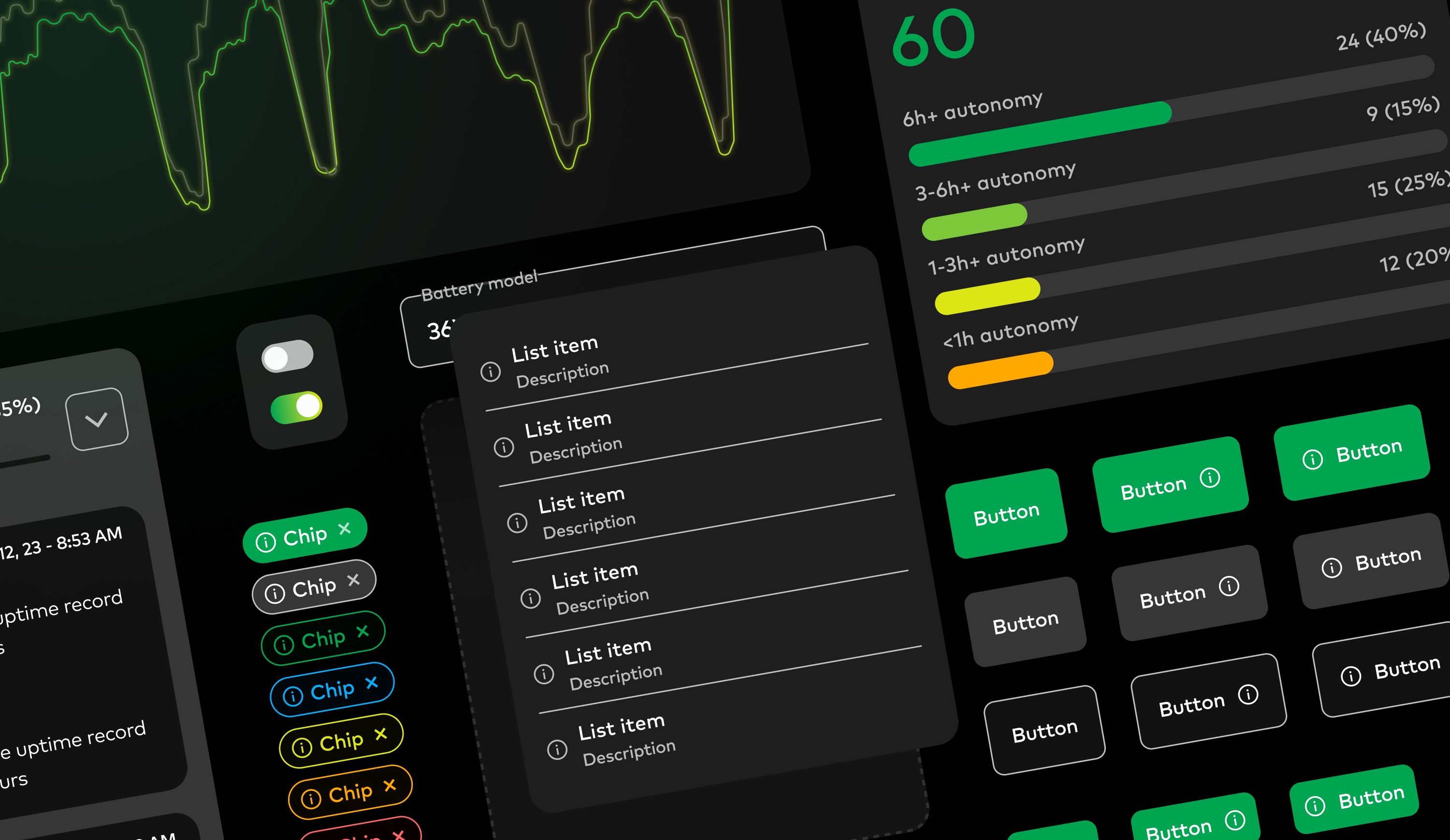
I adopted a simplified Atomic Design approach to build a scalable component system.
For a project of this scale, I used a simplified version of the Atomic Design methodology, which helped build a modular component library and save time by reusing micro-components across the system.
Ugowork’s dev team was leaning on Bootstrap for its frontend architecture. I took some time to familiarize myself with Bootstrap’s nomenclature and architecture before even starting to work on the system to make sure I’d be able to build something that would make sense for everyone.
The mission was spread across two sprints of two weeks during which I kept in close touch with the clients to ensure alignment.
![[Fig.2] Example of a list-item component built following the Atomic Design principles.](/static/c93cf220eda9cef2a0c90a1b5678915f/e3356/List-items.png)
Building a system that was flexible, documented, and ready to evolve.
Building the design system went smoothly. I began by focusing on styles, then moved on to layout and components, and finally addressed templates and design resources. Shortly after I started, Figma released a major update introducing variables and a new dev mode. I leveraged these new features to support potential future light mode. By assigning colors, radii, and spacings to variables, I ensured components were easy to use, including many Booleans, text variables, and comprehensive documentation.
![[Fig.3] Overview of the variables defined for UgoWork.](/static/881a92ad1e3c48a0d1559572f766c178/e027d/variables.png)
Using prototypes to clarify interactions and edge cases early.
Another key aspect for the client was making sure all components where interactive and prototyped so they could build interactive mockups before moving to dev. It was also very important for them to clarify their interaction language and patterns.
Preparing designs for a smooth developer handoff.
One thing I was very keen on was making sure the design system would be easy to handle for everyone, especially for developer. Ugowork’s team didn’t had an in-house designer at the time, devs and PMs would be the main users of this system.
I made sure to assign clear descriptions and functions to each color to highlight the visual language and general system. For the dev team, each variable was clearly tied to its Bootstrap equivalent.
Each component also had its own description and instructions for how to use. While still rather high-level, clearly documenting this whole system was meant to help non-design people build new interfaces without breaking consistency or the system.
The new system was instantly adopted by the whole team and is now serving as a base for all of the new features of the application.
I also had the opportunity to assist the team with their icon system and helped them further implement consistency across their marketing and print systems.