Elevating the commercial real estate experience.
CREED reached out in 2023 after a rebrand, looking to bring their new visual identity into their app and website. I helped shape a scalable design system and worked on core product features.
- Industry
Commercial Real Estate
- Team
1 PM, 1 designer (me), 1 developer
- Website


Translating brand identity into product reality.
CREED approached me fresh off a brand refresh by a creative agency. They had a new logo and visual direction but struggled to translate that "premium" aesthetic into their web and mobile products.
The challenge wasn't just visual. CREED's platform needed to feel intuitive and trustworthy for users navigating high-stakes commercial real estate transactions. A polished interface alone wouldn't cut it, we needed to build a scalable design foundation that could evolve with the product.
![[Fig.1] What the app looked like when I joined.](/static/92c3c62fe5dba78eadb865b7ea5fe96d/319f5/before.png)
Expanding brand assets into a functional design language
Styles and semantics
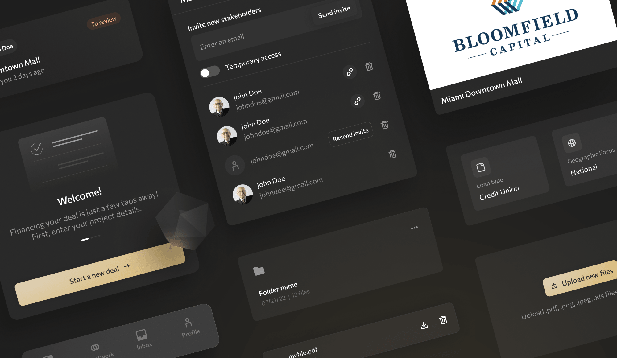
Starting with CREED's refreshed logo and typeface, I developed a comprehensive color system designed for flexibility and accessibility. I introduced additional shades to improve contrast ratios and defined semantic color roles (success, warning, error) to support future feature development.
![[Fig.2] Extract from the new color palette and text styles.](/static/b03152d9599fd3246cb2e46c0364d22a/319f5/design-system-2.png)
Design system
Once the colors and foundations were locked in, I moved on to the design system. I took some time to audit the existing product to identify all the components and patterns we’d need. Following Atomic Design principles, I started with small elements and gradually built up to more complex components and layouts — which made it easier to document, reuse, and scale.
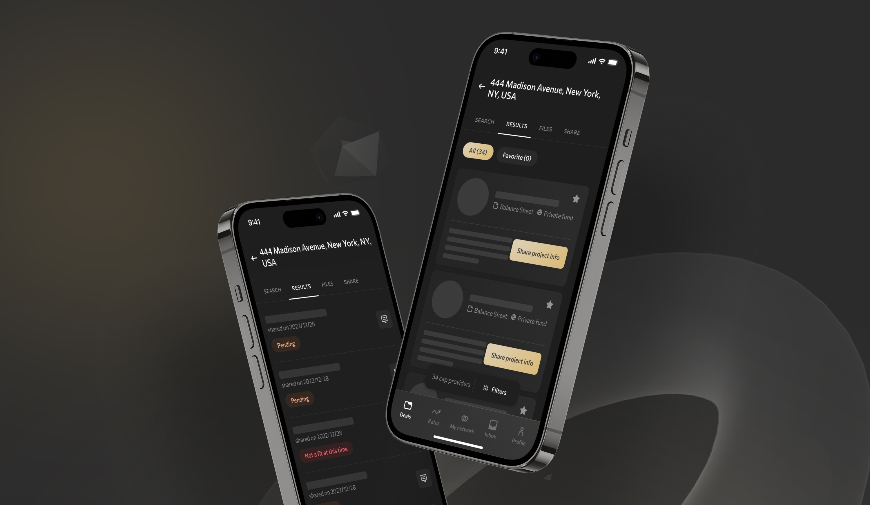
Reimagining deal discovery as a clear, efficient, and intuitive flow.
Context
Finding commercial real estate deals typically involves hours of research, fragmented communication, and industry connections. CREED's vision: streamline this process with an intelligent search tool that matches users (investors or lenders) with relevant opportunities based on their criteria. The main pain points with the old search were:
- Confusion between search and deal profile.
- No clear next steps after inputting criteria
- Manual text entry for all fields—no guided options
First iteration
I separated search into a dedicated flow with a full-screen modal. While this improved focus, user testing revealed new issues—editing criteria felt buried, and search didn't feel central enough to the experience.
![[Fig.3] One of the envisionned flow for CREED's search feature.](/static/95fe5bac1bd14e557265fd0d4c23b2c6/319f5/search_iterations_1.png)
Why it didn’t work:
- Editing search settings was buried too deep.
- The search didn’t feel central enough to the experience.
Next iterations
After doing some testing and collecting feedback from test users, we returned to a familiar tab-based layout, which gave users better spatial awareness of the platform's capabilities while keeping search accessible.
![[Fig.4] Iterations for the search screen.](/static/04ae8df4f553cd0aff4fcc18787443d4/319f5/search_iterations_2.png)
What we explored:
- Option 1: Clean and familiar, tested best for clarity and trust
- Option 2: Split the form into visual sections, with icons to guide the eye. Improved scanability but reduced overview.
- Option 3: Used accordions and a progressive disclosure model. Helped focus but increased interaction cost.
Polishing things up
While Option 1 which was the simpler, it was also the one that felt the most clear, efficient and familiar to our test users. Nonetheless, our other explorations helped us spot useful components and patterns we brought into the final design:
![[Fig.5] Dynamic action bar component](/static/35c898ae4660b0d4c5c642c14b00f8bf/85789/search_key-components_1.png)
![[Fig.6] Illustrated dropdown component](/static/605de8e3c3fdc922adb99c02b666ddae/85789/search_key-components_2.png)
A clearer, more focused product that balanced simplicity and flexibility.
The final product stayed true to the original concept but with clearer hierarchy, reduced cognitive load, and improved usability. For CREED, restraint was a design principle. This is a professional tool, not a showcase—so we avoided unnecessary animations or UI flourishes in favor of clarity and trust.
This project reinforced an important lesson: good design for B2B products often means getting out of the user's way.
![[Fig.7] Before and after results.](/static/4f1b7f683f1c9fd4b9844ab240553f01/319f5/before_after.png)
Extending the system beyond the product.
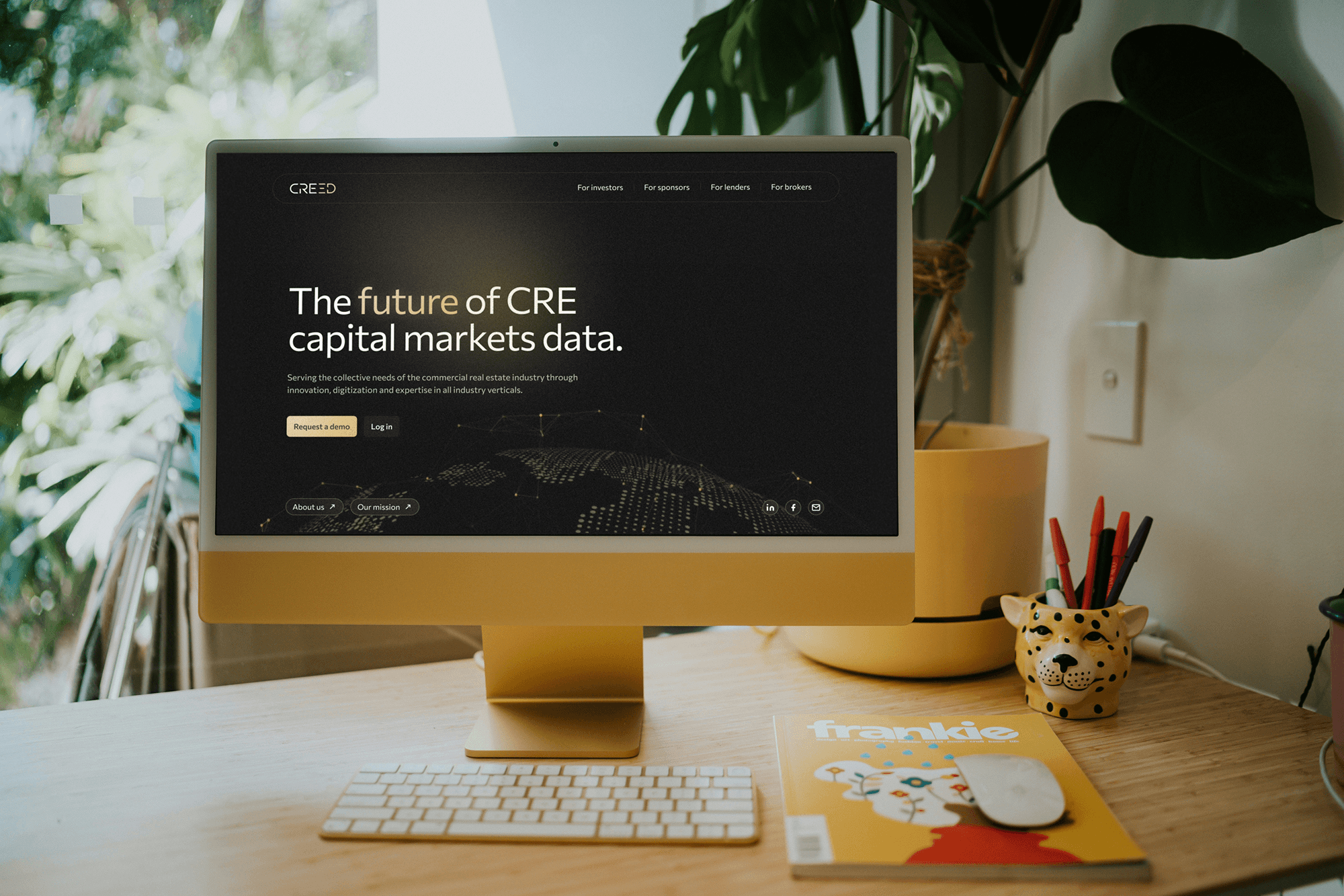
In addition to updating web and mobile apps designs to reflect the new design system and brand direction, the team also trusted me to redesign their website and create a full suite of marketing assets — from sales decks to email templates — most of which they’re still actively using today.
![[Fig.8] Examples of marketing posts designed for CREED.](/static/0a74a5ff09ffa9b49ead6d56fe25fc74/319f5/marketing.png)