Project overview
Lemon is a internet and mobile plan comparator that always strives to do more. The site provides its users with a series of up-to-date content and tips to help everyone take advantage of the best offers on the market.
Visit website ▸My contributions
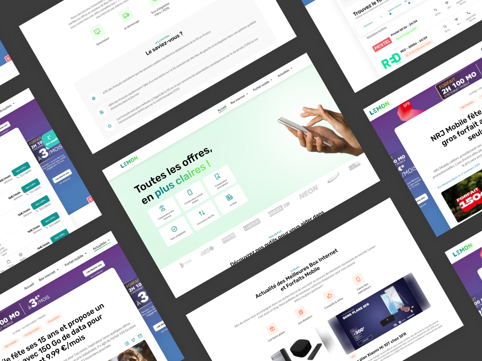
I worked on the complete redesign of the platform and its visual identity. Until then, Lemon was a functional site but needed a little facelift to be up to date. This graphic transition also aimed to accompany Lemon's shift towards a content-based site focused more on news and research than on the comparator feature. The main challenge was thus to rebrand and simplify the whole platform, without getting rid of any content.
Visual identity & UI design
The challenge
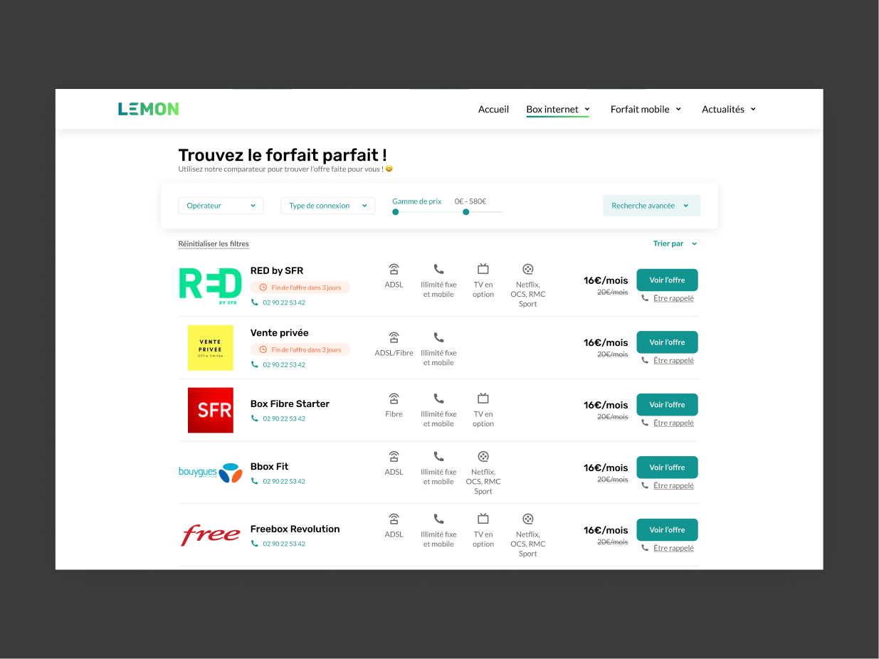
The main challenge with this project was the amount of text to deal with: all of it had to be kept for SEO purposes. By playing with colors and sizes, I tried to reflect an image of clarity and lightness of content, without affecting the amount of information available.
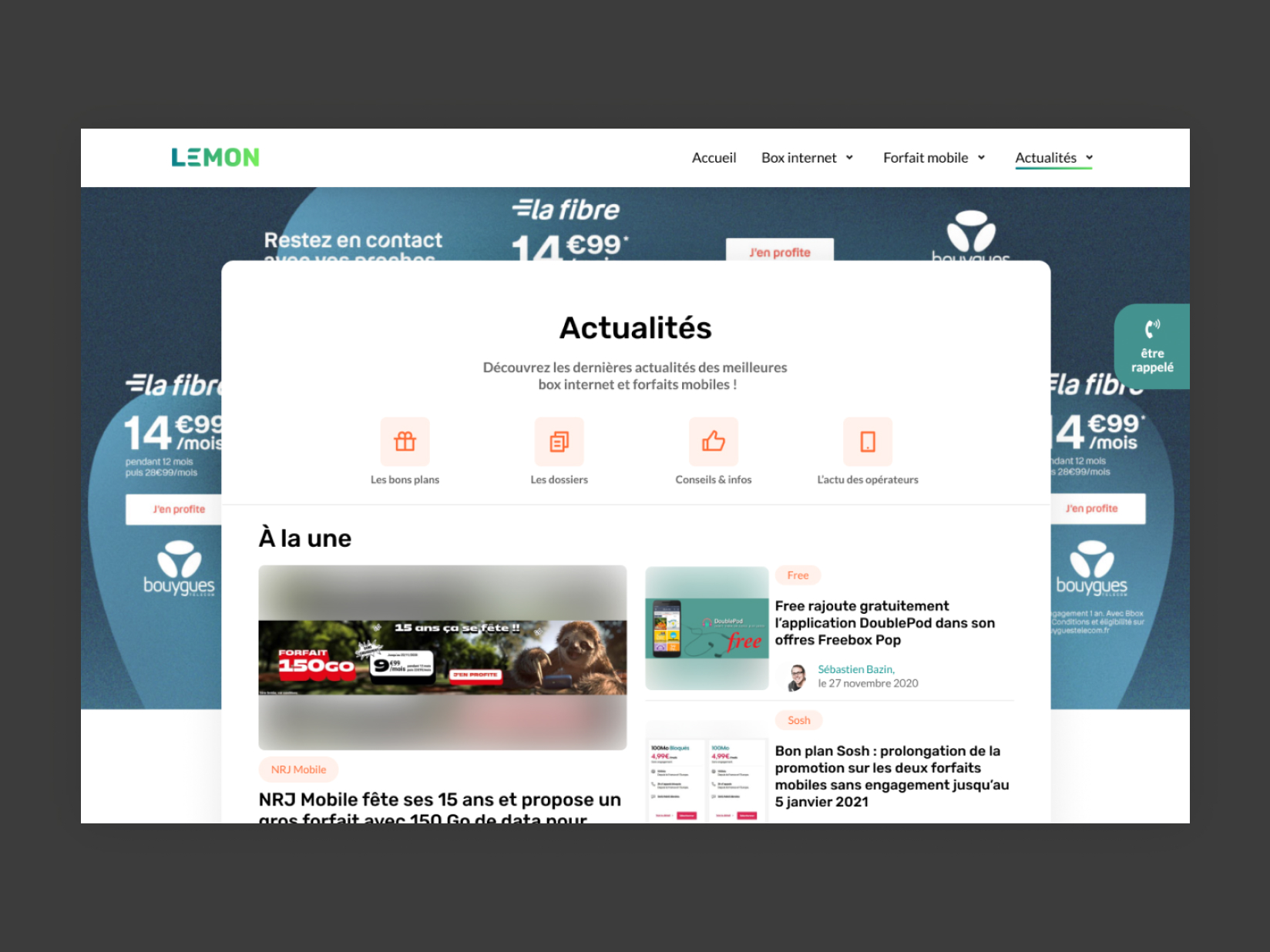
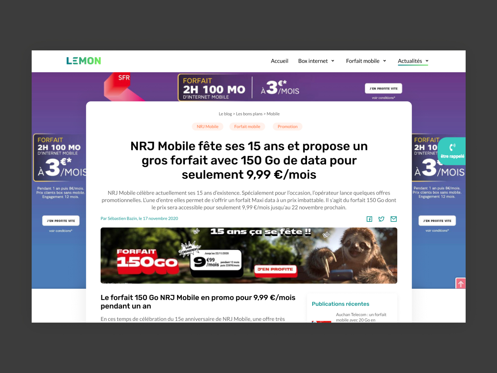
As part of the project, I also had to design different templates to be used in the blog part or as content pages. So I gave a particular importance to the differentiation of these pages, to make the navigation fluid. The idea was that a blog article should not be confused with a content page and vice versa.
How I worked
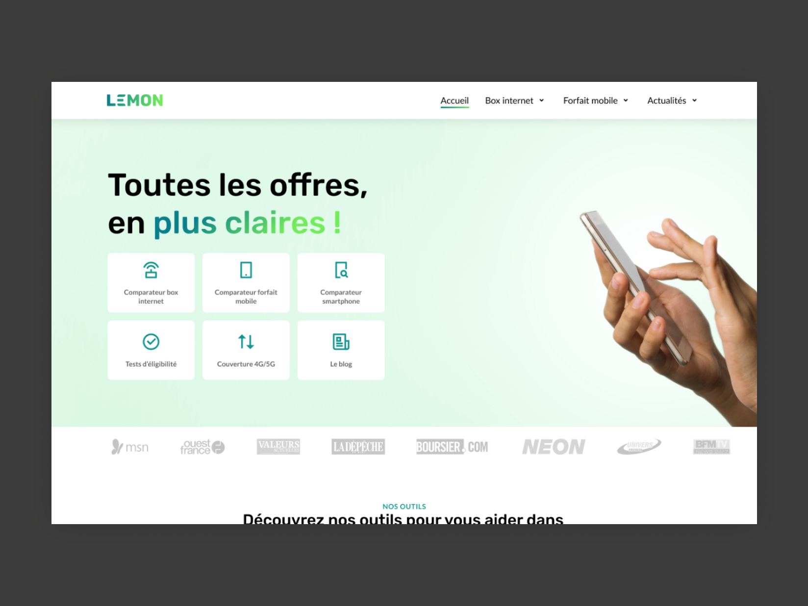
In order to convey this impression of clarity and freshness, I paid particular attention to the choice of color. It had to be neutral enough not to swear too much with the advertising displays in the background and distinctive enough to mark the brand's identity. After several trials, I chose green, a color that inspires confidence and evokes simplicity and modernity. By playing with shades of cooler to warmer tones, I tried to emphasize Lemon's dynamism as much as possible. To maintain some balance and not overpower the content and images, I decided to use whites and greys as main colors for the components. The greens are thus used for calls to action, to attract the user eye, while grey nuances outline and structure the whole.
Concerning the layout, I took a lot of inspiration from current news websites, in order to create a navigation and a reading as intuitive as possible. The result is a hybrid between a corporate website and a news blog.
I essentially worked with Figma for the creation of the prototype, the tool allowing a significant ease of exchange with my client.