Project overview
Freeworker is a platform for self-employed workers. By transforming the services into a salary, it allows its users to benefit from salary protections (health insurance, unemployment, retirement pension, ...) without taking away their independence.
My contributions
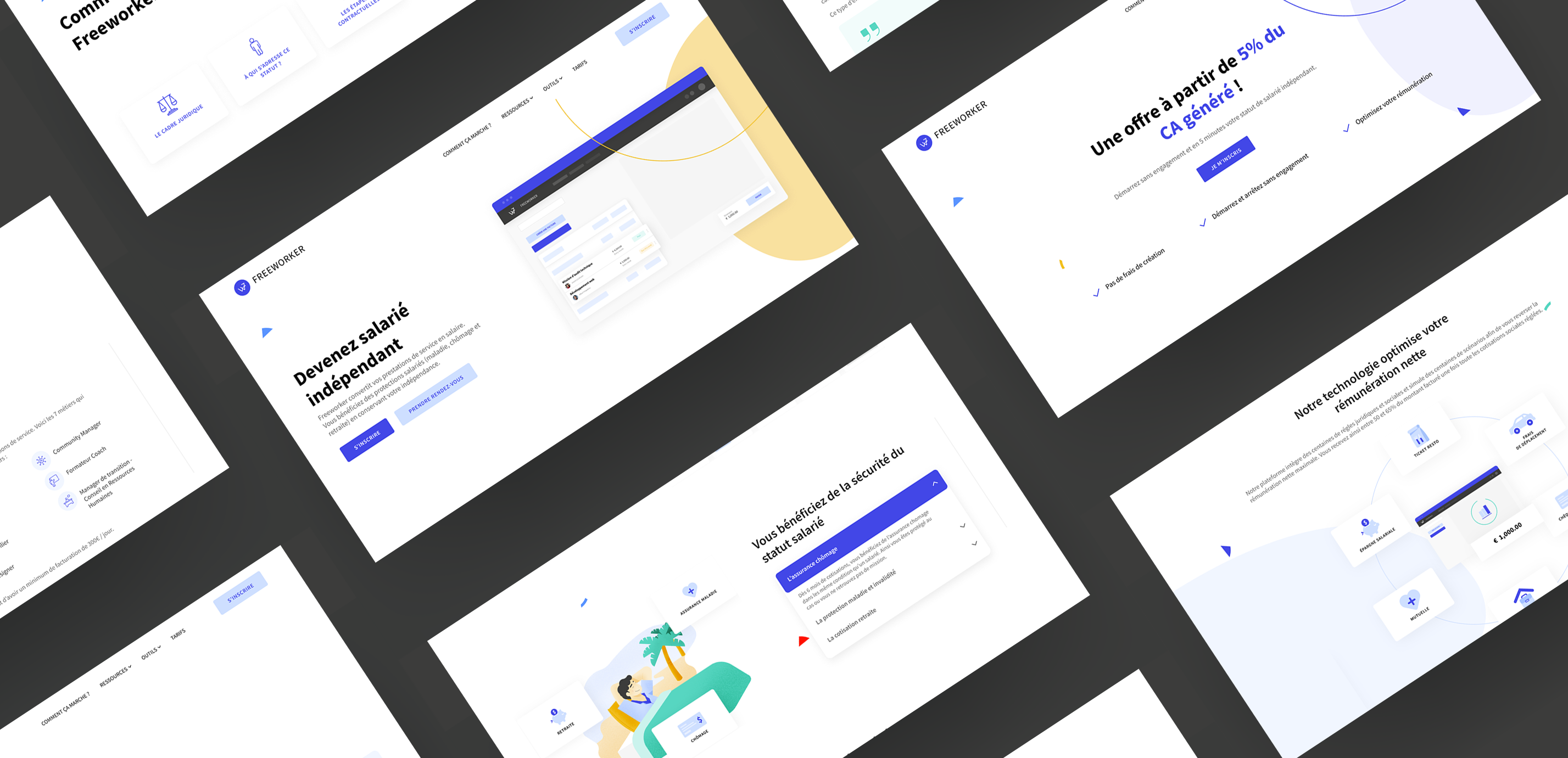
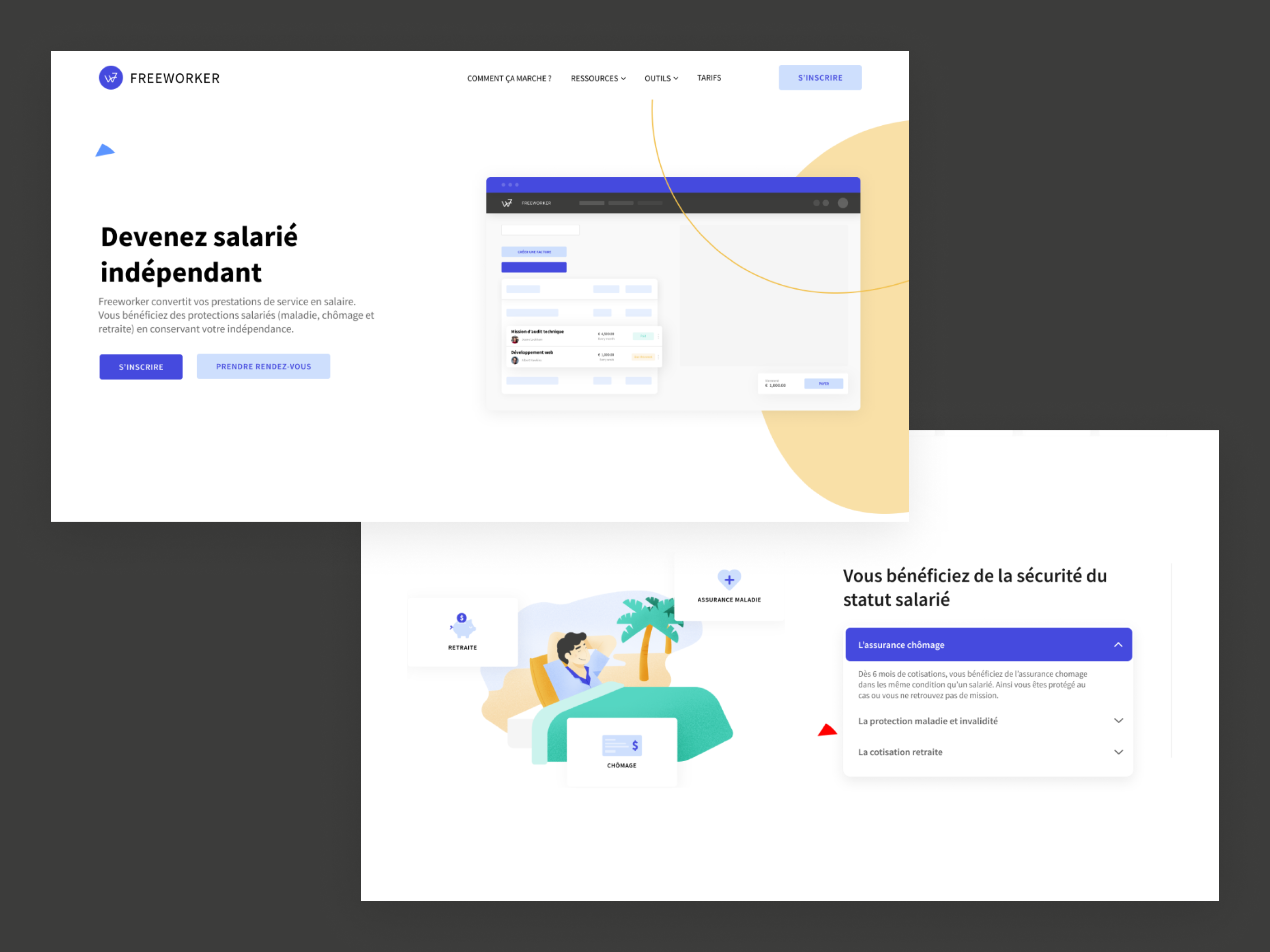
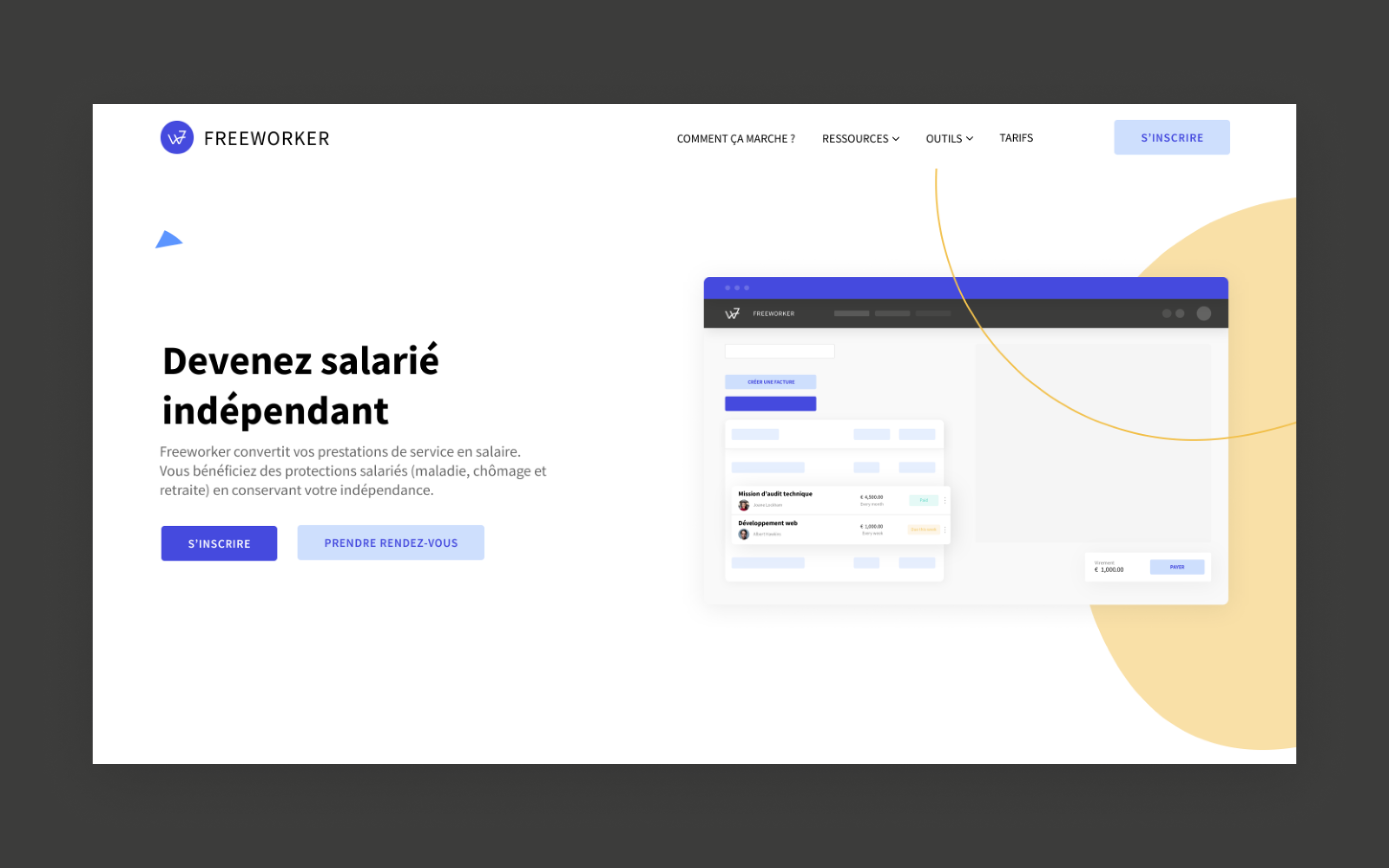
I was charged with the creation of the company brand identity as well as with the design of its website. The client wanted a clean and professional look, to stand out from the already existing wage portage platforms. By adding a lighter and more modern look to it, the idea was to appeal to a larger audience. The main challenge with this project was to find a good balance between fun and professional. I spent a lot of time working on illustrations and decorative elements to give the website a nice dynamic and apprehensible look.
Visual identity and brand guideline
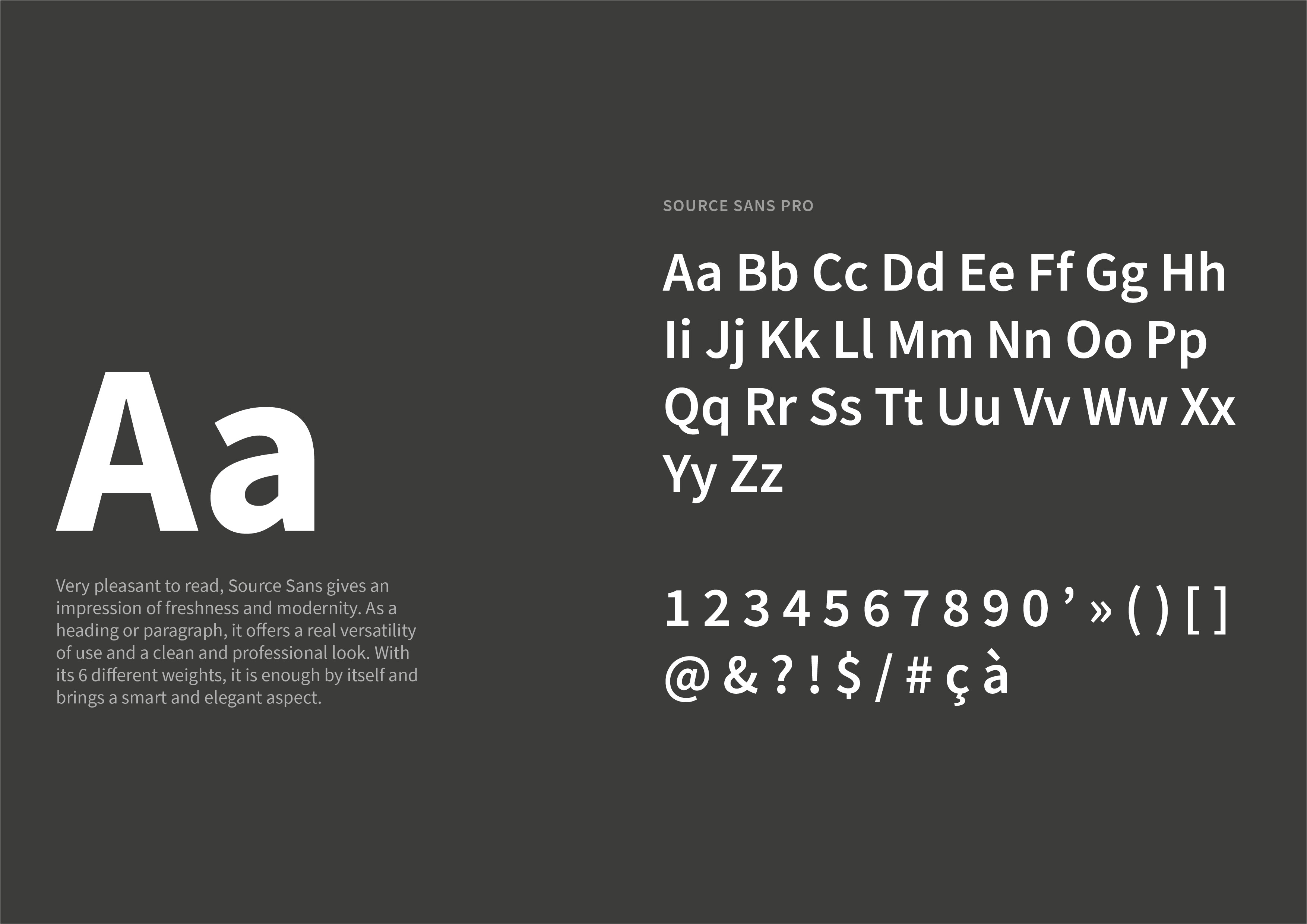
After a first research and benchmarking phase, I made the following observation: most of the current portage platforms in France suffer from a somewhat outdated image, certainly professional, but not very attractive. As a result, few young entrepreneurs feel concerned by the "portage" system. To counter this, I turned to current design standards: vibrant colors, a strong typeface, playful illustrations and abstract forms.
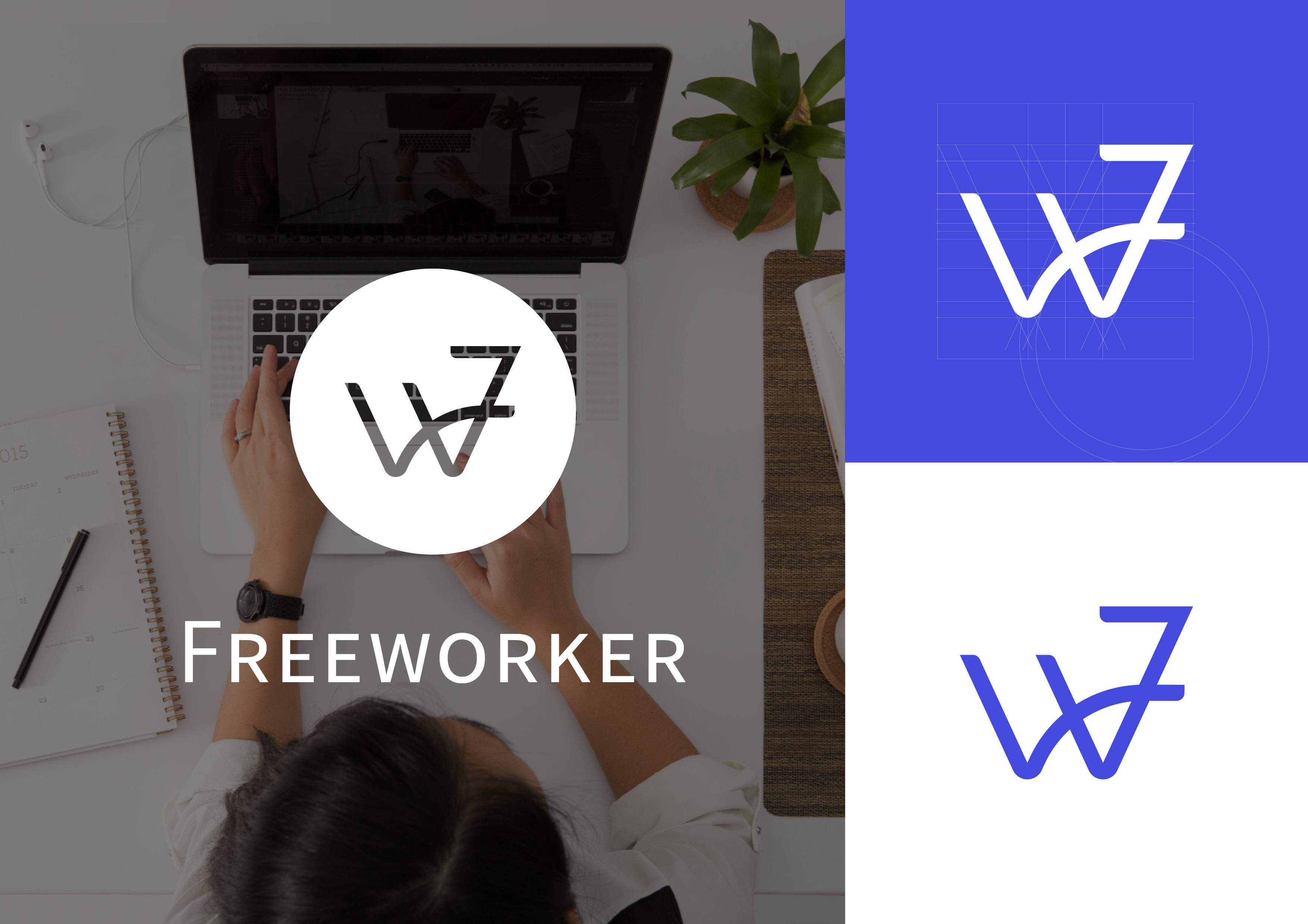
The company logo is the result of a mix between the "F" and the "W" of Freeworker. The first "u" of the "W" evokes a flying bird, symbol of freedom and independence. The global shape of the logo resembles the silhouette of a person holding something up, hence refering directly to wage portage and the values of solidarity at the core of Freeworker. The asymmetry of the logo height and the rounded angles give it a sense of energy and youth.

Webdesign & illustration
The design of the company's website was made under two constraints: the client wanted it to run entirely on Wordpress and I also had to take care of the integration. I therefore had to deal with a set of technical limitations in order to achieve a functional final product. The site had to be simple, rather minimalist, so that the reader would not be overwhelmed by the content and to convey an overall impression of ease and usability.
To bring a more playful and attractive side, I also worked on several illustrations, diagrams and infographics.