Project overview
Bloc Solutions is a Quebec-based company that simplifies the landlord-tenant relationship and rental management. The platform offers its users the ability to create 100% electronic leases, collect rent payments and communicate easily with their tenants and employees.
My contributions
I was hired by Bloc Solutions to design the future features of the platform. In collaboration with my lead designer, we were tasked with finding the best solutions to create simple and easy to integrate designs, while modernizing the overall look of the app and brand.
UX design
The challenge
When I arrived at Bloc Solutions, the platform already had strong usage patterns. Initially built to revolve around the lease creation feature, most of the features had an almost identical flow and design. This flow, while appropriate in the early days of the platform, quickly became limiting and part of my mission was to think about how to improve and work with these restrictions.
Research and rethink
Since changing the entire platform was not an option at first, I took the initiative to start a UX analysis and research phase to prepare the ground and ensure that our future designs would be heading in the right direction. I also wanted to help consolidate our design proposals by bringing them an additional level of justification and argumentation.
From heatmaps analysis, personas research, recordings and customer support queries, I tried to use all the tools at my disposal to make the research as complete as possible.
What I found
Conducted over the long term, this research allowed me to become aware of and raise several weak points of the platform:
- The lack of a complete onboarding flow was creating some glaring tension points, especially with our less digitally experienced users
- The home screen, our dashboard, did not sufficiently guide our users on the next steps and actions to take on the platform. It was actually barely used.
- The different design patterns lacked consistency across the platform, which led to confusion among our users.
All of these findings allowed us to re-evaluate the priority of certain design changes and to justify the designs behind certain features. I was also able to gather a bunch of recommendations and tips about the whole platform that could be used in the future. In addition to improving and streamlining the user experience, these various UX findings will help reduce the workload of the customer support team in the future.
Conclusion
In addition to creating zonings and wireframes for Bloc Solutions feature, I had the opportunity to work on a more thorough UX analysis of the platform. Conducted over several months, I was able to better understand our users and their behavior and to provide a number of recommendations that will be useful in the long run.
UI design
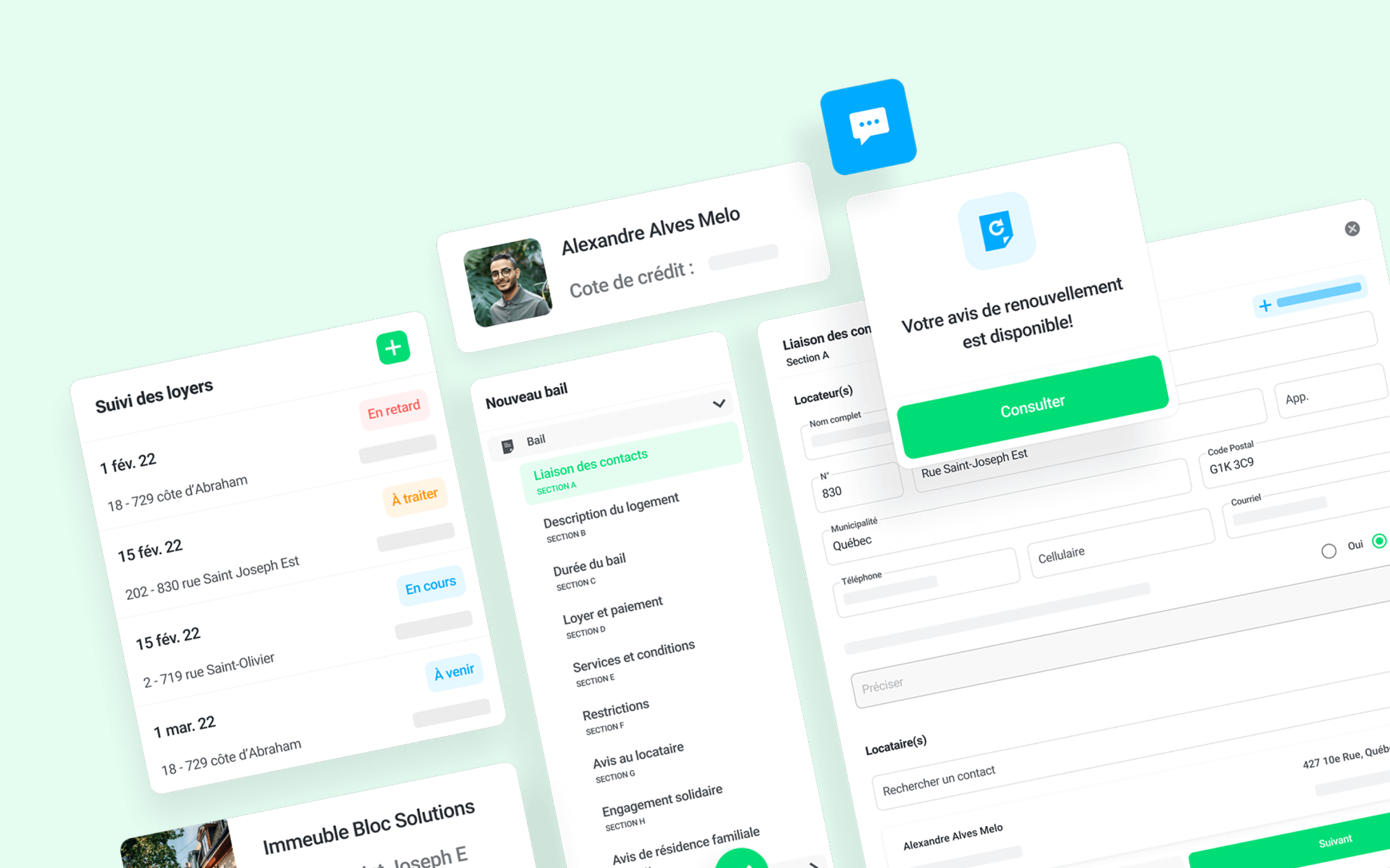
UI design was at the heart of my mission at Bloc Solutions. In addition to designing new interfaces, our goal was also to modernize the overall look and feel of the platform. During my year at Bloc Solutions, I had the opportunity to participate in the creation of several features, from wireframing to prototyping.
My arrival, in June 2021, coincided with the design of one of the most important features of the platform, namely the rent tracking. The stakes around this feature were all the more important as they concerned our users' money. The different interfaces had to be as intuitive, clear and reassuring as possible.
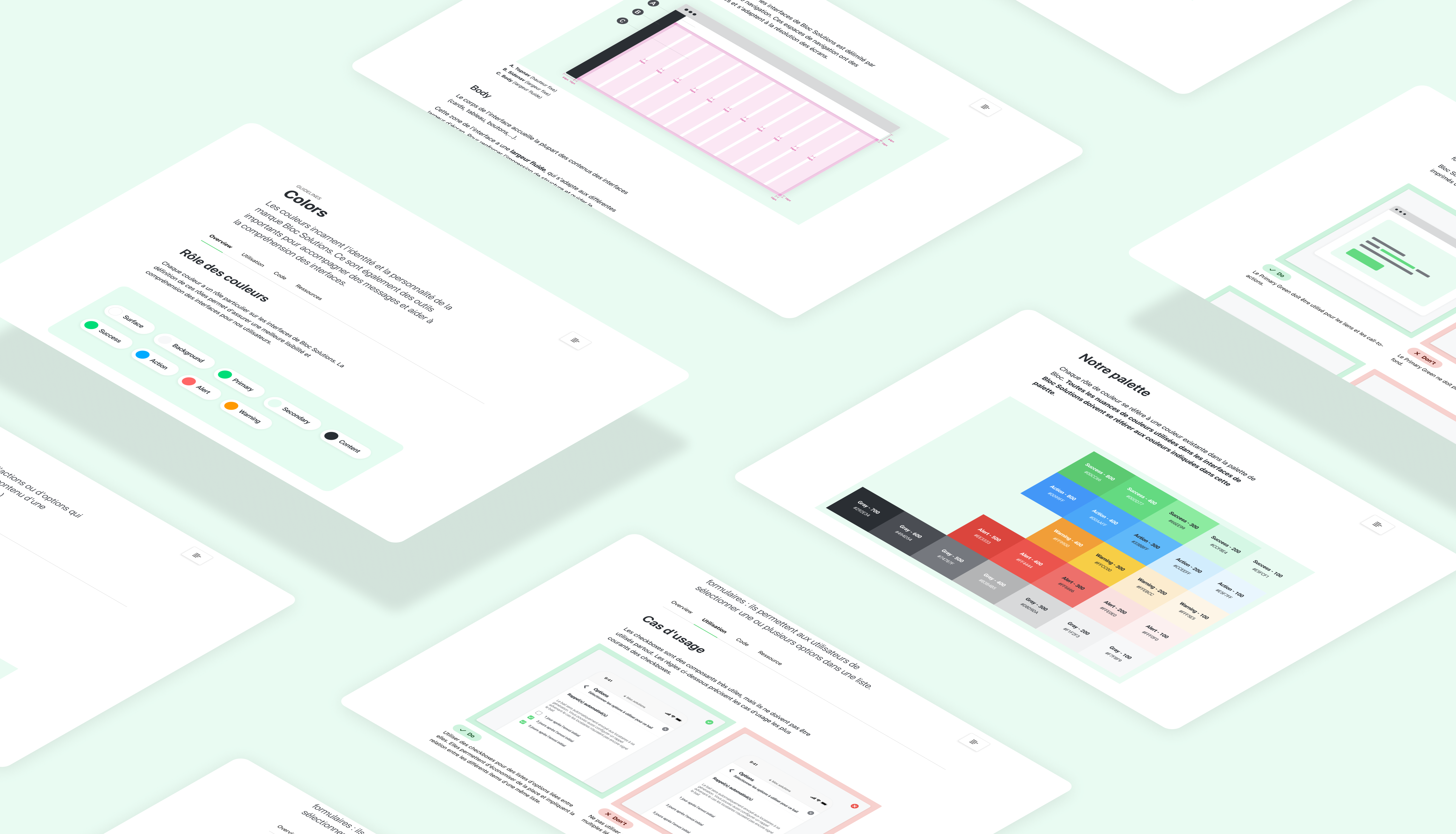
Creating a design system
Although feature design was a big part of my work routine at Bloc, one of the most rewarding projects I was able to participate in was the creation and enrichment of the design system and its documentation.
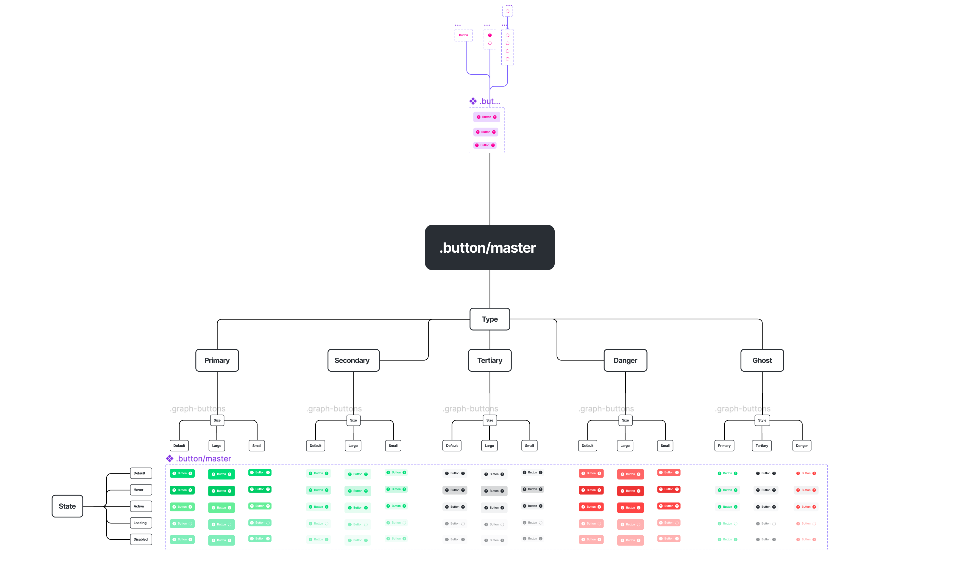
In order to facilitate the management of the Figma components system used in the interfaces and to maximize its use, Bloc Solutions design system is inspired by the principles of Atomic Design. Each component is broken down to its smallest atom. Inspired by the rules of physics, this method gives a more organic feel to all designs and ensure better consistency.
I was able to create several components using this principle, including a new button and tag system. Beyond the work of breaking down the elements, the conception of components according to the principles of Atomic Design forces you to consider and foresee the various states of an element of an interface before their deployment. This helps to avoid unnecessary round-trips, which are often the cause of consistency problems in interfaces.
Documenting our design work
Even though our design system was already well set up on Figma, none of our components were documented. This posed several problems, especially when transmitting our designs to developers. Since Figma is not necessarily easy to use for non-designers, a lot of information was lost and we had to do a long verification work each time a new feature was published. In addition, the fact that no common documentation support existed meant that no one really spoke the same language: the developers had their own components, our design team used others, which made design updates difficult to follow. Passing knowledge from designer to designer was also complicated.
Shortly before I left the company, I took the initiative to create the most complete documentation possible of our components and our various design principles. Built on Zeroheight, this documentation gathers all the rules of use of the colors on the interfaces as well as the styles of all the components. A set of guidelines and resources ensure the transmission of knowledge between all team members and simplify the work of developers.