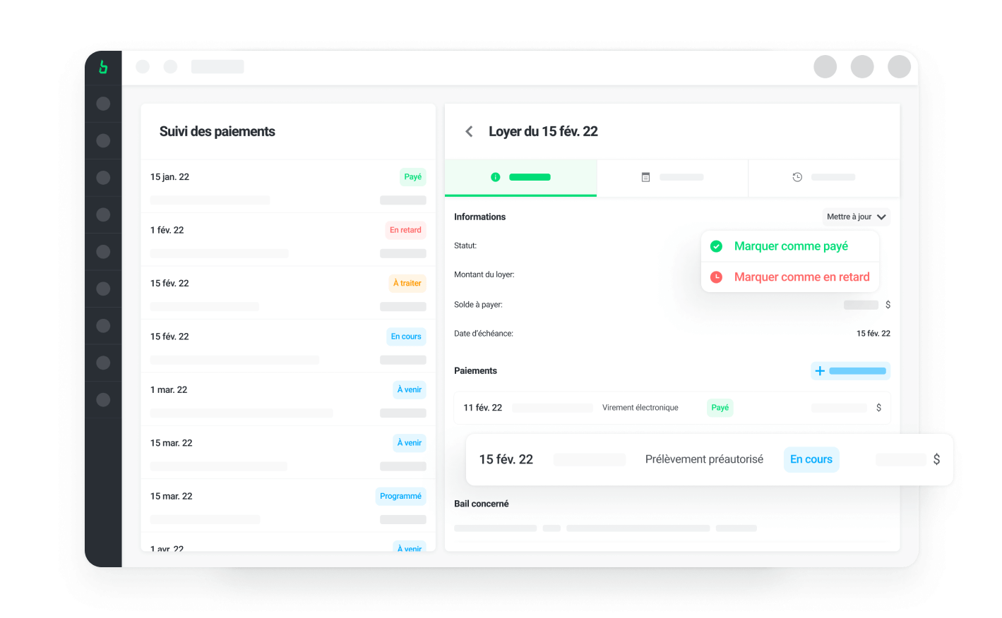
Building a payment tracking feature for landlords
Feature design was a significant part of my work. During my time at Bloc Solutions, I mainly worked on the payment tracking feature of the app. This project was led over 6 months, in collaboration with Vincent (my lead designer at the time) and Julien (our product owner and project manager). Our main challenge was finding creative and intuitive ways to integrate the feature to the rest of the app without impacting the legacy structure.
We made countless iterations, leaning heavily on Figma's prototyping abilities to test and re-test our flows and interactions. This ended up being one of the most popular feature of the Bloc Solutions app, thanks to the built-in flexibility and advanced tracking options.

Creating a design system
Another very rewarding projects was creating and enriching the design system and its documentation.
I developed several components over the span of my year with Bloc Solutions that were later implemented in the app, including a new button and tag system. All of our components were created following the Atomic Design method. We chose this approach for its flexibility and scalability. I strongly believe that a design system should be conceived as a toolbox or language, not as a strict framework that dictates designs. Using this approach allowed our design team to be more efficient, consistent and improved our handoff processes with the dev team.

Documenting our design work
Despite having a well-established design system in Figma, none of our components were documented. This caused issues, especially when handing off designs to developers. Since Figma can be challenging for non-designers, much information was lost, necessitating extensive verification each time a new feature was released. The lack of common documentation led to inconsistent components and design updates.
Before leaving the company, I took the initiative to create comprehensive documentation for our components and design principles using Zeroheight. This documentation includes usage rules for interface colors and component styles, providing guidelines and resources to ensure knowledge transfer among team members and simplifying developers' work.

